Color is a visual language understood by all, felt by many, and thoughtfully employed by few. It is a universal language that when used strategically truly transforms a building into a work of art. Thanks to the structure of our brains, we all process color using a perceptual judgment process. That is one of the reasons architects and artists understand that color is an integral part of any project.
Although color is a natural tool for many architects, some claim that color in architecture is too whimsical for modern architecture. In an essay on the subject, Timothy Brittain-Catlin explains the “innate puritanism among clients of architecture,” architects and their “embarrassment of confronting color,” and how “modernism tried to ‘educate out’ bright colors.” As we continue working in the modern era, let’s look at the ways you can use color on your next project.
International Influences On Color

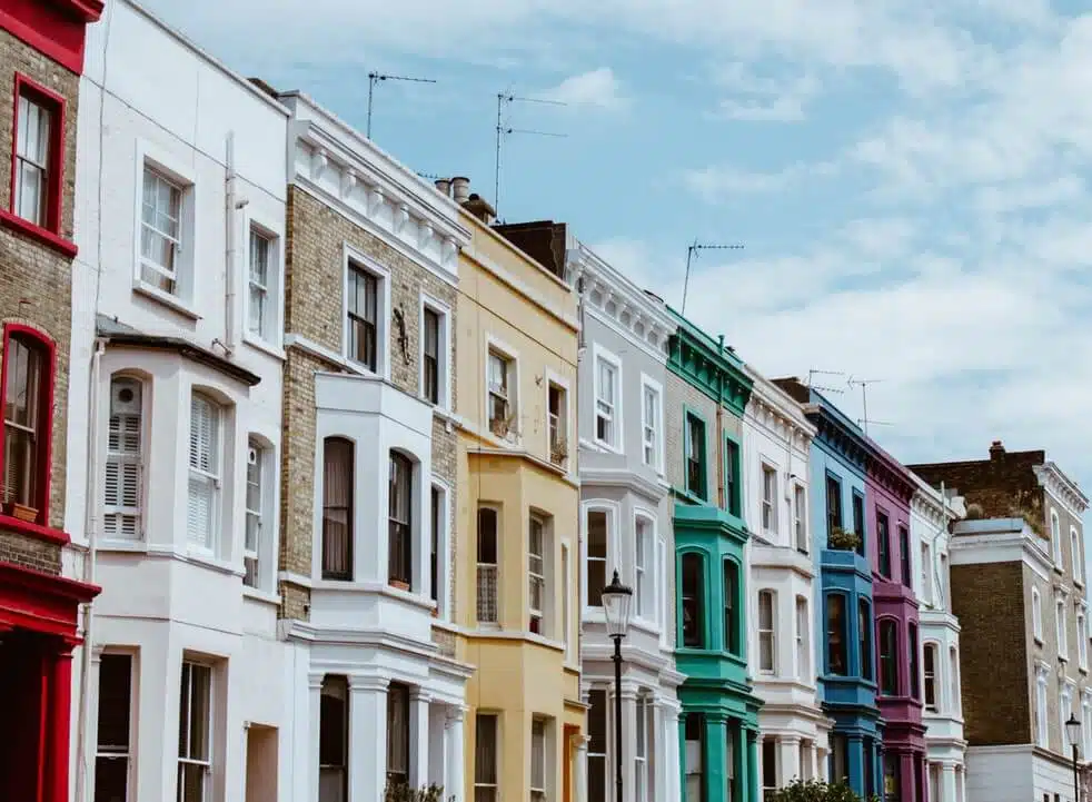
Travel to another country, and you will quickly realize the beauty that stems from using color in architecture and design. Usage of colors in buildings has evolved over the years. From the azure streets of Chefchaouen, Morocco to the ethnically diverse city of Cape Town, South Africa, the unusually bright colors standout among the more muted colors of the contemporary world.
Today, these colorful neighborhoods are some of the most eccentric tourism magnets in the world! In the past decade, some traditionally bleak towns including London and other European cities started using bolder colors on the exterior and interior of homes.
While brighter colors can change the appearance of a city significantly, many architects hesitate to get involved in the color evolution. Since colors help develop perspective and deepen a viewer’s understanding of architectural design, it is a wonderful tool that most architects hold in their back pocket.
Here are a few tips on how you strategically use color in architecture.
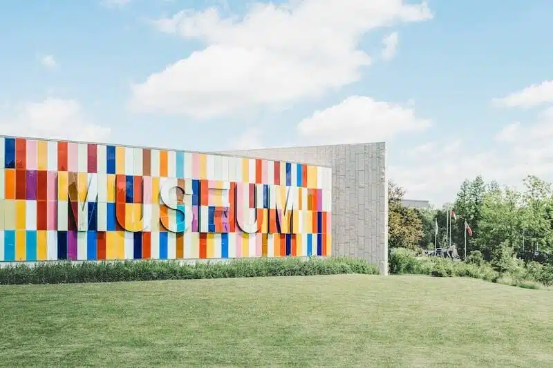
Add a Pop of Color To Enhance Overall Feel
Architects and designers have always favored colors like whites, greys, and other subtle tones. Now, architects slowly realize the effects a bright and colorful building can have on on-lookers and the overall feel of a city. You can get on-board by adding smaller elements of color in your projects. This works well for food courts, medical structures, and other buildings that need a welcoming appearance.
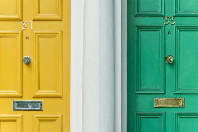
Use Color to Highlight Architectural Features

Color is a potent tool for embellishing an otherwise streamlined design. Not only can you try adding color to the exterior of a building, but you can also use it on the interior, as well. Whether you include color on the inside of a detailed archway or add a simple coat of paint to a vaulted ceiling, color is a great way to enhance the details of your projects.
Take a Hint from Nature When Choosing Colors
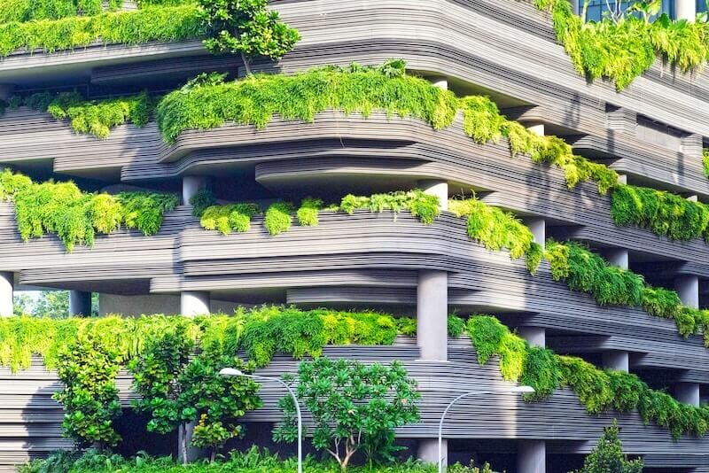
Peak outside, look around and notice the ways color brings life into the world around us. Some universal associations are uniform like the blue of the sky and yellow of the sun. You can use nature to blend in with the area surrounding your projects or stand out from it. Not only is color a great way to bring an earth-driven element to your buildings, but it also feels entirely natural for those viewing it, as well.
Know Your Associations
Color and symbol association has psychological effects. In fact, tests show that even if a person is blindfolded their pulse will noticeably calm when exposed to blue. You can use these factors and reactions to manipulate feelings correctly and explain more thoroughly the purpose of your buildings.
For example, brown has a subduing effect that is popular among architects thanks to its warm, secure, and stable association. On the other hand, pink is lively and calming. But pink must be handled carefully as not to appear too weak or nuanced. Finding the right color palette is the perfect opportunity for architects to make a dramatic statement.
Understand Visual Ergonomics
Only the most advanced architects understand the factors surrounding color specifications and eye adaptation. Increase your knowledge of visual efficiency and comfort to better employ color in your architectural design. You should also understand the perception of the colors you choose. Taking all of the science and aesthetics into play will help you design buildings that are visually stimulating without exhausting the viewer.
Get Professional Advice
If you need help understanding how you can use color in your next project, contact the professionals at Think Architecture. We love discussing ideas and bringing everything full circle with our knowledge of basic architecture formulas and experience in the industry. Get in touch with us today.
We look forward to hearing from you.